
Why Some Beautiful Assortments Still Fail at Retail
Beauty gets attention. Retail decides survival.
This is one of the hardest truths in home decor.
A collection can look refined in a showroom. It can photograph beautifully. It can even feel trend aligned and emotionally right. Yet once it enters real retail conditions, the strength begins to fade.
The shelf tells a different story.
A buyer may admire the assortment and still hesitate. A retailer may place it and still struggle to move it. A visually strong range may create excitement at first and then lose momentum because it was built for impression rather than for use.
That is why some beautiful assortments still fail at retail.
Not because they lack design value.
Because design value alone is not the same thing as retail fitness.
Retail does not judge beauty in the same way a mood board does
A mood board can celebrate nuance. A retail floor has to convert nuance into movement.
This is where many assortments become vulnerable.
An assortment may feel elegant in isolation but weak once it is forced to answer practical questions:
Does the customer understand it quickly
Does the price ladder make sense
Can the items live together on shelf without visual confusion
Is there a clear entry point
Is there enough variation without losing coherence
Can the assortment survive handling display and replenishment
When those answers are unclear, beauty starts to lose power.
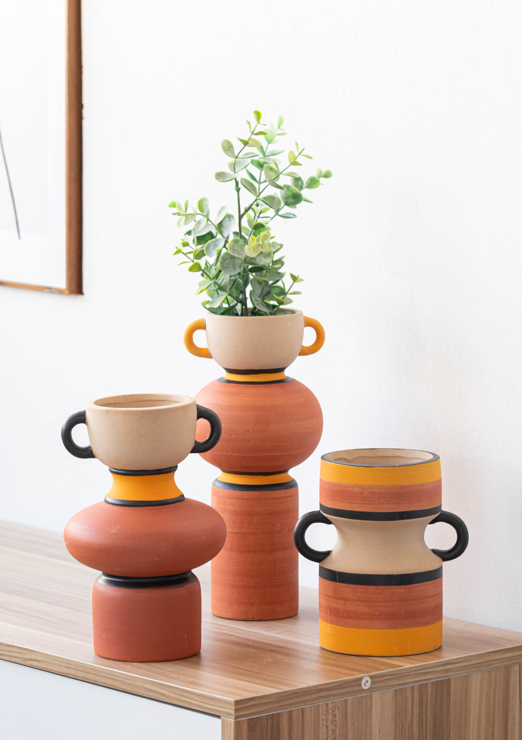
Some assortments are beautiful but hard to read
This is one of the most common problems.
A buyer may look at an assortment and feel that every piece is attractive, yet the total picture still feels difficult. That usually means the assortment is visually rich but commercially unreadable.
A retail ready assortment should let the buyer understand the internal logic quickly.
Which item leads
Which item is safer
Which piece opens the price conversation
Which one lifts perception
Which one helps the whole group feel connected
If everything sits at the same level of intensity, the assortment can feel elegant but strangely flat. If everything feels special in the same way, nothing becomes easy to place.
Retail does not only reward attractiveness. It rewards readability.
Beautiful assortments often fail when they confuse role and value
A strong assortment usually needs role clarity.
Some pieces should create attention. Some should create comfort. Some should support the bridge between the two. When that structure is missing, the assortment may still look polished, but it becomes hard to turn into a selling environment.
This is where many decor assortments lose force.
They may have style consistency, but no commercial hierarchy.
They may have finish harmony, but no role balance.
They may have design quality, but no buying logic.
A buyer feels this almost immediately.
Even if they cannot name the problem in one sentence, they know the assortment is asking them to do too much mental assembly.
Price imbalance can quietly weaken a beautiful assortment
This is another reason some attractive assortments fail.
A supplier may have built a collection around strong aesthetics without paying enough attention to price architecture. The result can be an assortment where all the pieces feel too elevated or too similar in value perception.
That creates pressure.
The buyer starts wondering:
Where is the easier entry item
Where is the safer volume piece
Where is the item that supports margin without creating fear
Where is the piece that helps the assortment widen its reach
Without those layers, the assortment may feel visually complete but commercially narrow.
Retail usually prefers assortments that can invite different kinds of customers into the story. If the whole assortment feels like one note at one level, the audience becomes smaller.
Some assortments look better in pictures than they do on shelf
This is a very real problem in decor.
A supplier may build around image strength rather than spatial strength. The assortment looks wonderful in styled photography, but once the items stand in open retail space, the weaknesses become visible.
Perhaps the silhouettes are too similar.
Perhaps the tonal differences are too subtle.
Perhaps the textures do not separate enough in real light.
Perhaps the scale relationships feel uncertain.
Perhaps the stronger piece has no supporting item that helps it sell.
A shelf is less forgiving than a photo.
A retail ready assortment has to hold together without camera help. That is a much harder test.
Beauty without repetition logic often becomes a short term win
A buyer can fall in love with a visually strong assortment and still hesitate because they do not yet trust what comes after the first order.
That hesitation is often tied to repeatability.
Can the finish be reproduced consistently
Can the assortment grow without losing coherence
Can successful pieces be extended
Can weaker pieces be replaced without breaking the whole story
Can this range survive a second season or a revised presentation
An assortment that feels too dependent on one visual moment may generate initial interest but weak reorder confidence.
Retail buyers are always thinking about what happens after the first yes. That is why visual attraction alone is not enough. They need signs that the assortment can continue living.
Operational drag can damage even the best looking assortment
This is one of the least romantic but most decisive points.
A beautiful assortment can still fail if it creates too much operational friction.
That friction may come from:
fragile shapes that are hard to pack
inconsistent finishes that are hard to repeat
awkward size relationships that complicate cartons
visual materials that are stunning but too sensitive in transit
product mixes that are elegant together but inefficient in real ordering
Buyers do not separate beauty from execution as cleanly as many suppliers assume.
If execution risk rises too high, the assortment becomes harder to trust. When that happens, even excellent design begins to feel expensive in the wrong way.
Retail success often belongs to assortments that are edited, not decorated
This is where the strongest suppliers usually stand apart.
They do not simply gather beautiful items. They edit for use.
They understand that a winning assortment needs:
clear role structure
a believable price spread
enough contrast to create interest
enough repetition to create confidence
a visual story that survives outside photography
an operational shape that does not collapse under real conditions
That kind of editing is what makes the difference between a collection that looks good and a collection that works.
In other words, retail ready assortments are not less beautiful. They are more disciplined.
The best assortments give buyers confidence before they give them excitement
This may sound counterintuitive, but it is often true.
Excitement attracts the buyer. Confidence closes the gap between admiration and action.
A buyer may love the design of an assortment, but if they cannot quickly imagine:
how it will be placed
how it will be priced
how it will be extended
how it will be packed
how it will be reordered
then the assortment stays in the realm of appreciation, not commitment.
This is why some quiet assortments outperform more expressive ones. They make the business path easier to see.
That clarity is deeply persuasive.
In home decor, retail strength is often the art of controlled compromise
The strongest assortments are rarely built by chasing pure beauty or pure safety. They are built by balancing both.
Enough beauty to earn attention.
Enough logic to earn confidence.
Enough contrast to create movement.
Enough structure to support repetition.
Enough flexibility to survive the real market.
That is what makes a collection useful.
And that is where a supplier like Teruierdecor can create real value. Not simply by offering beautiful products, but by helping buyers shape assortments that can move from visual appeal into shelf performance. That shift from taste to usability is where decor turns into business.
Final thought
Some beautiful assortments fail at retail because they were designed to impress the eye but not support the decision.
A retail ready assortment has to do more than look good.
It has to be readable.
It has to be placeable.
It has to be commercially layered.
It has to survive execution.
It has to make reorder feel possible.
That is what separates beauty that gets noticed from beauty that gets bought.
Leave a Reply